A BETTER WAY
TO MONEY
Rebranding
A BETTER WAY TO MONEY (PODCAST)
For Northwestern Mutual's A Better Way to Money® podcast, we led the brand strategy behind Season 3 — turning two seasons of momentum into an identity built on one insight: money is as emotional as it is financial.
The insight : 69% of millennials say money causes them anxiety. 75% say it strains their relationships. We built Season 3 to live right inside that tension — anxiety versus action — with a brand promise simple enough to carry the whole season: money belongs to everyone.
Role — ACD, Direction + Design
Client — Northwestern Mutual
Agency — UWG Inc.
Project — A Better Way to Money
The challenge
How do you stand out in the pod-osphere?
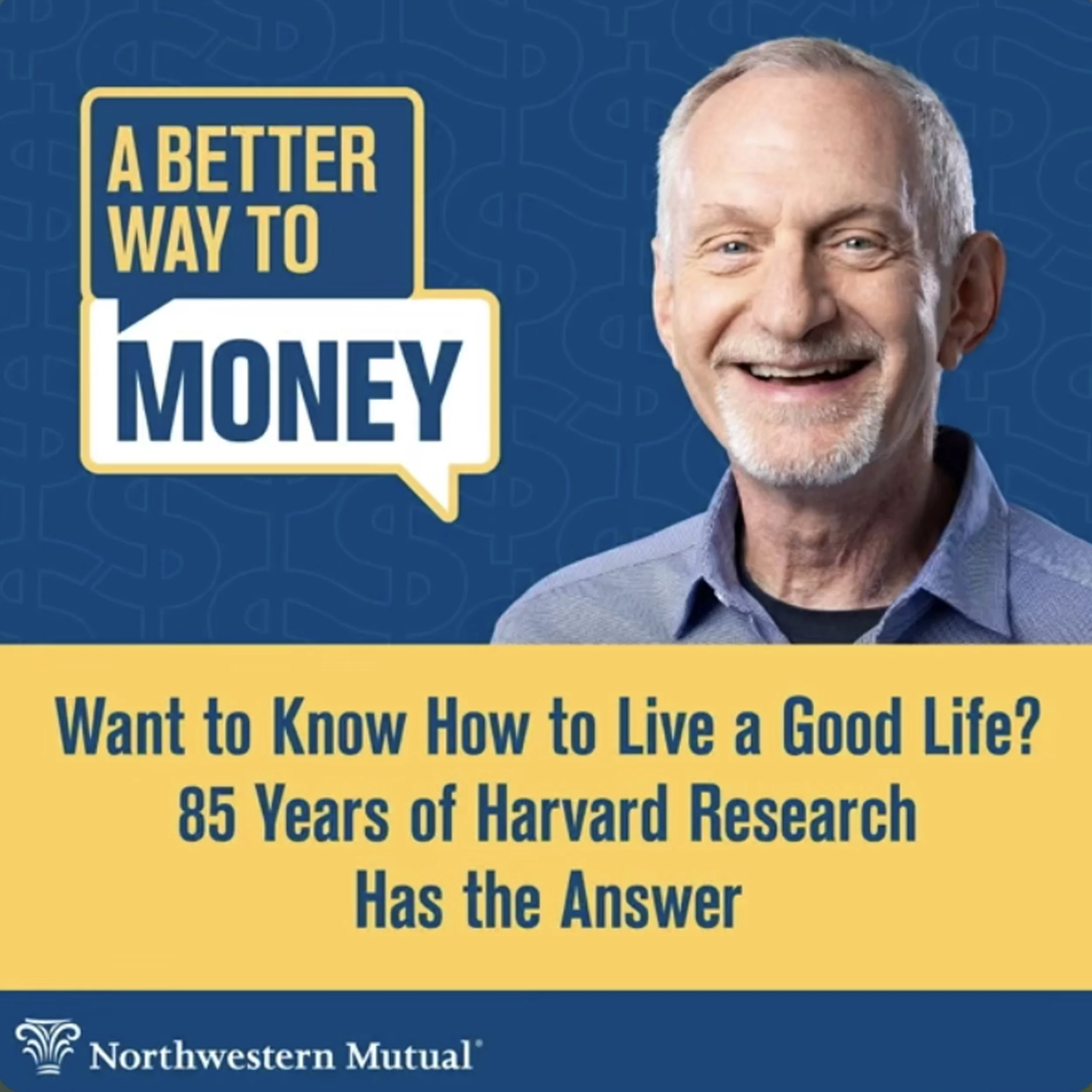
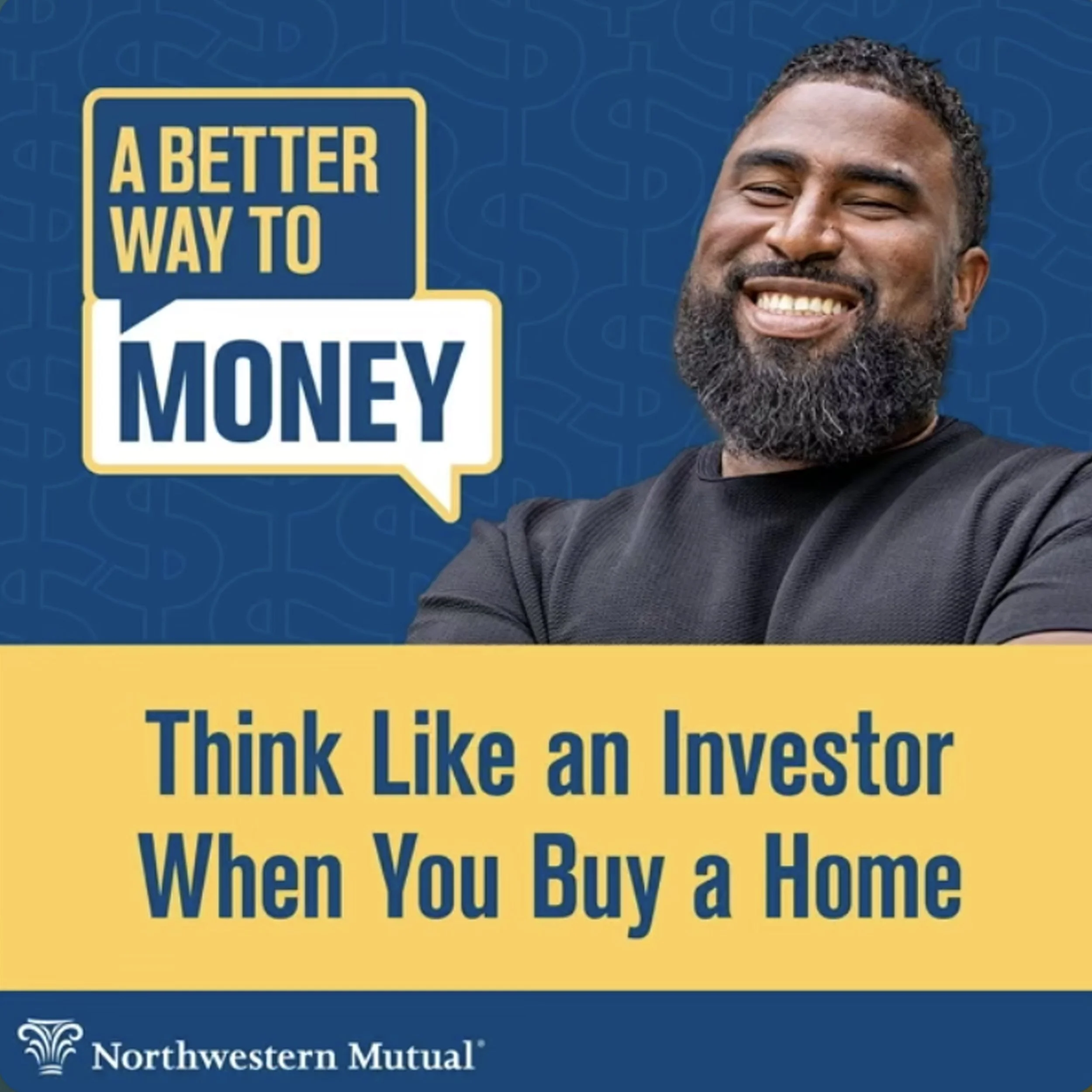
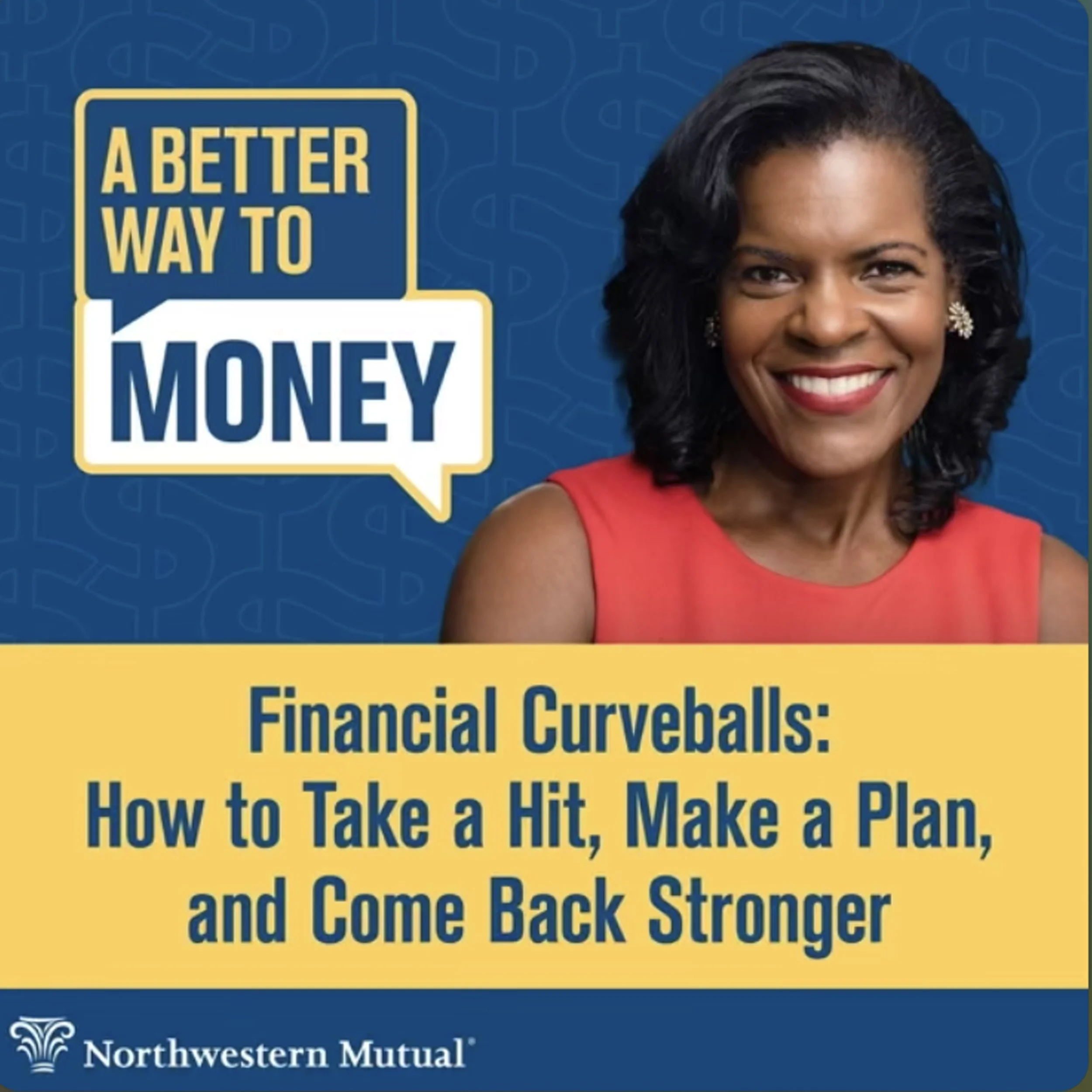
The show needed to feel less like a corporate podcast and more like a person. Adding real faces — hosts, guests, real people — gave it a layer of connection a logo alone couldn't.
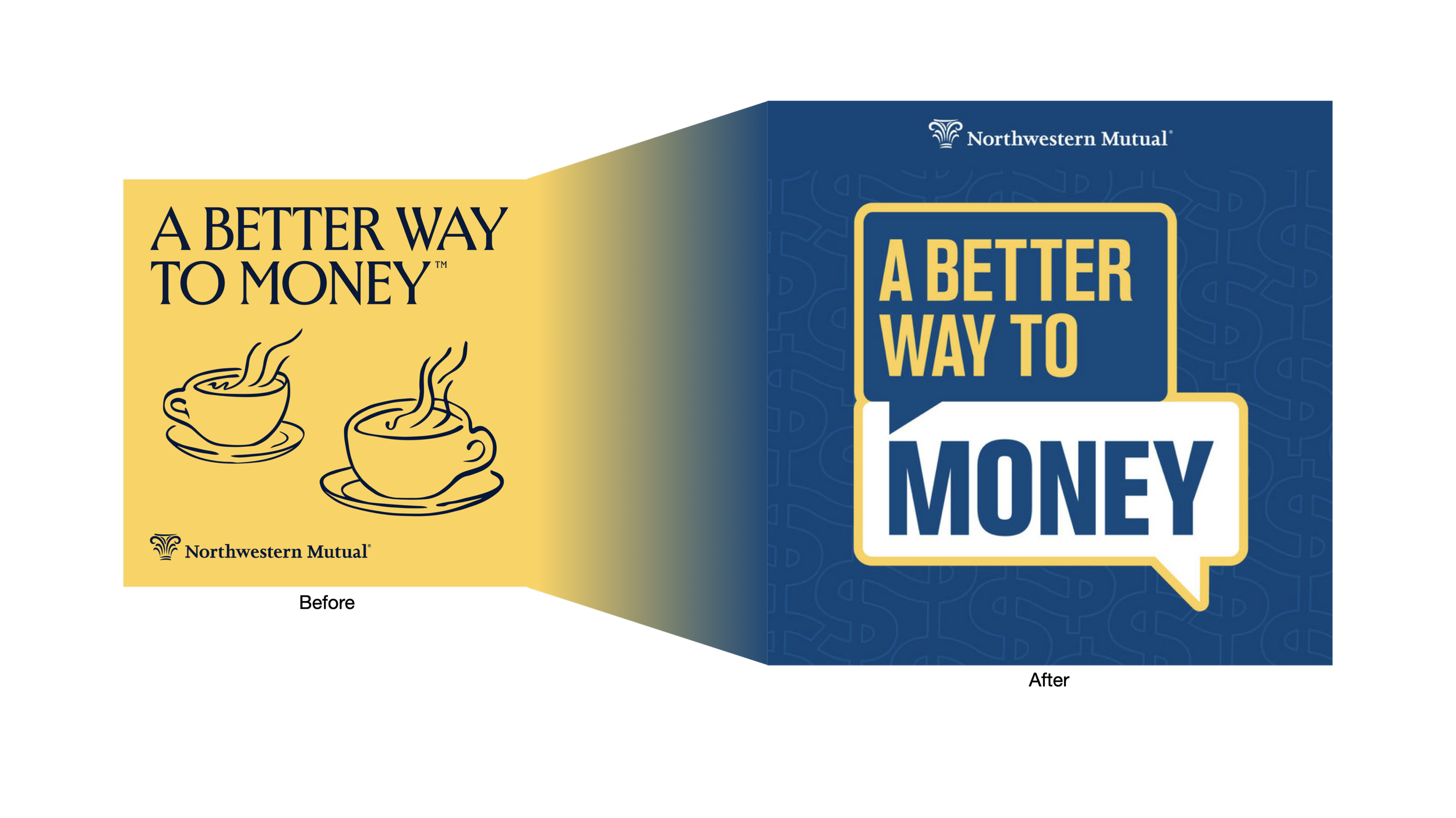
From formal to conversational
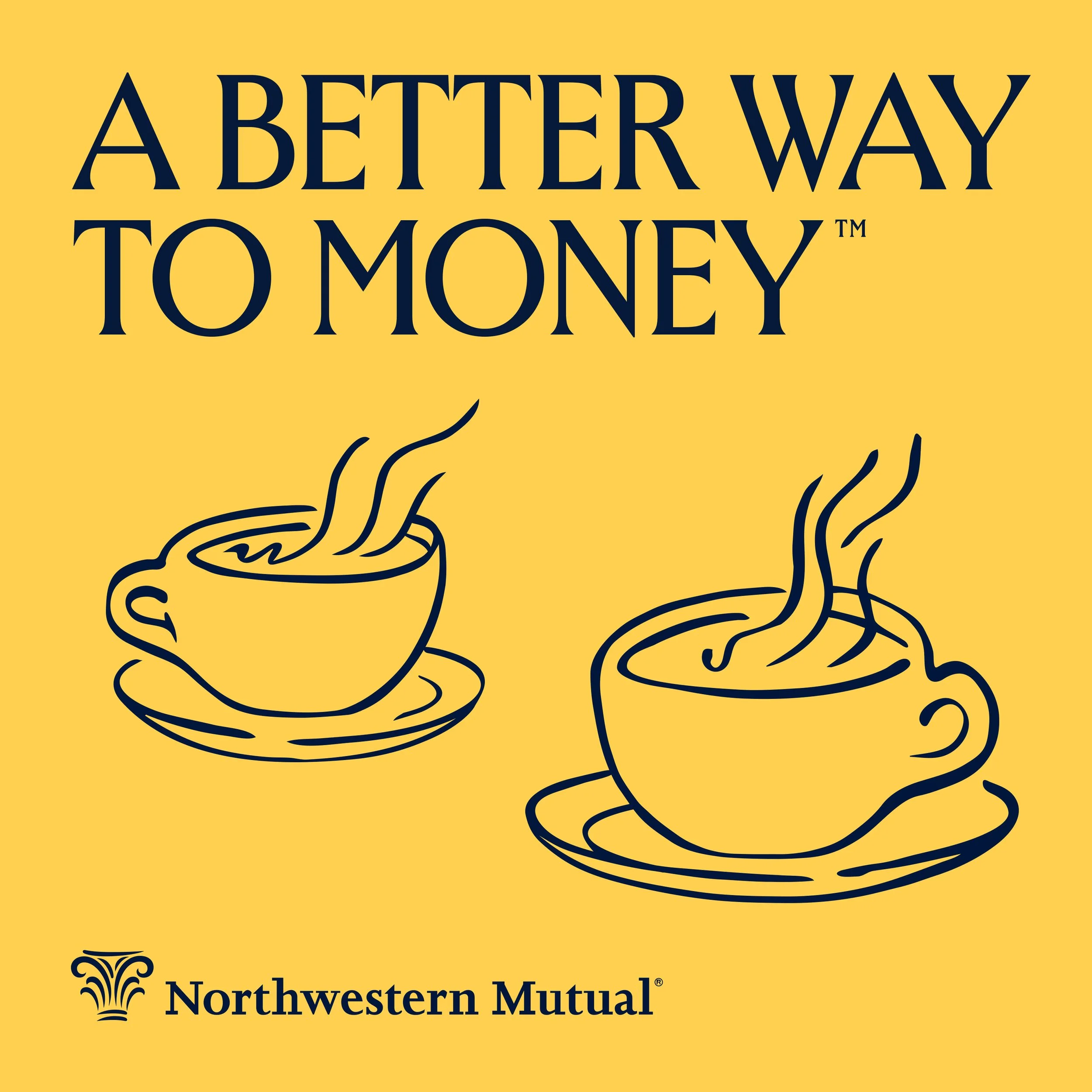
The old logo used two coffee cups to say "sit down and talk." It worked, but it wasn't own-able, plenty of brands say the same thing the same way.
The new mark replaces that borrowed metaphor with something built from scratch.
Make it look like talking.
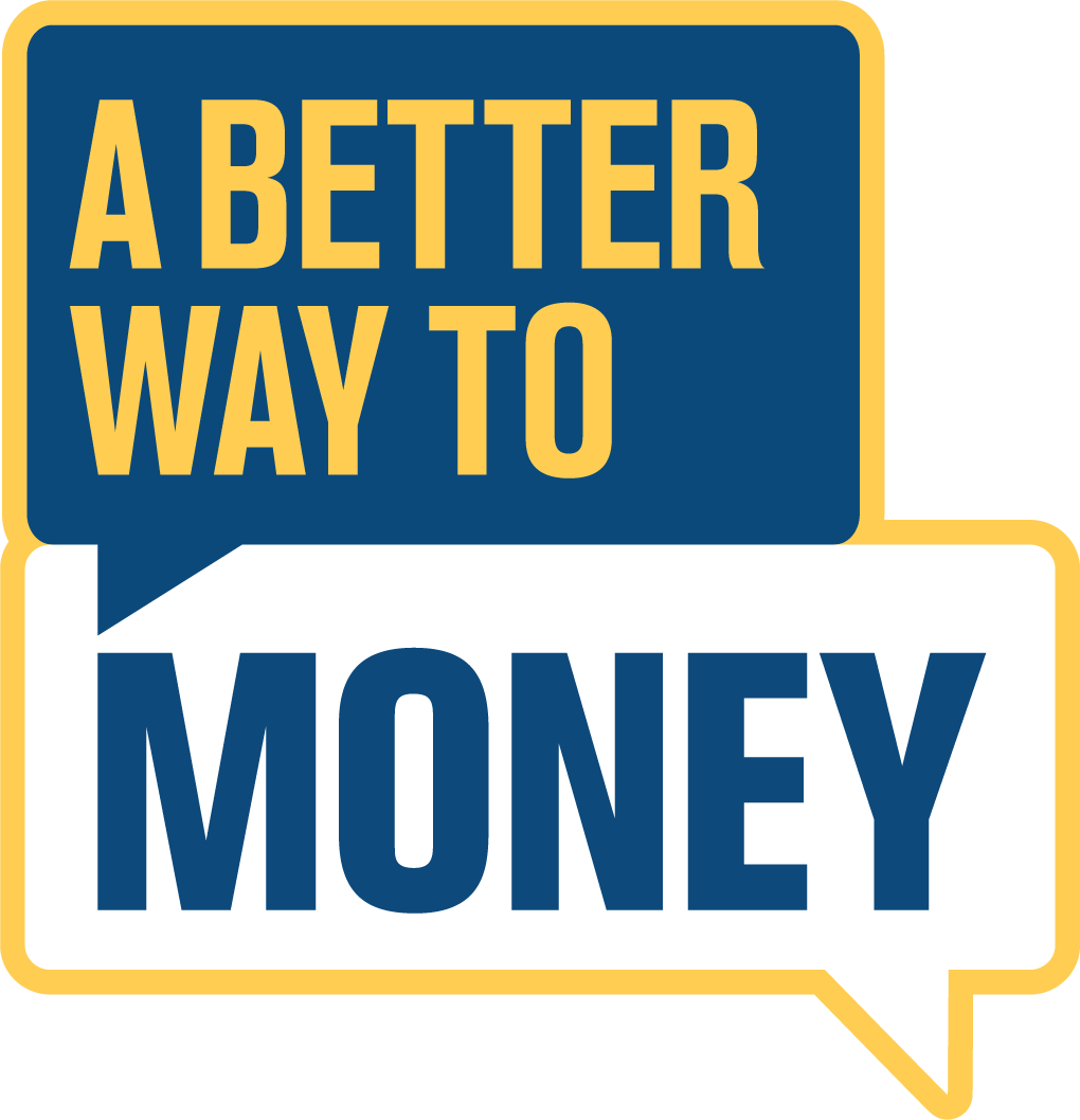
We landed with two speech bubbles, stacked.
"A Better Way" sits in one bubble, "Money" sits below it in another. The arrow points forward, like the conversation is moving somewhere — not just sitting still.
We tested a few color combinations to ensure it was high contrast and highly legible.

How could we stand out in the
Pod-osphere and find our audience.
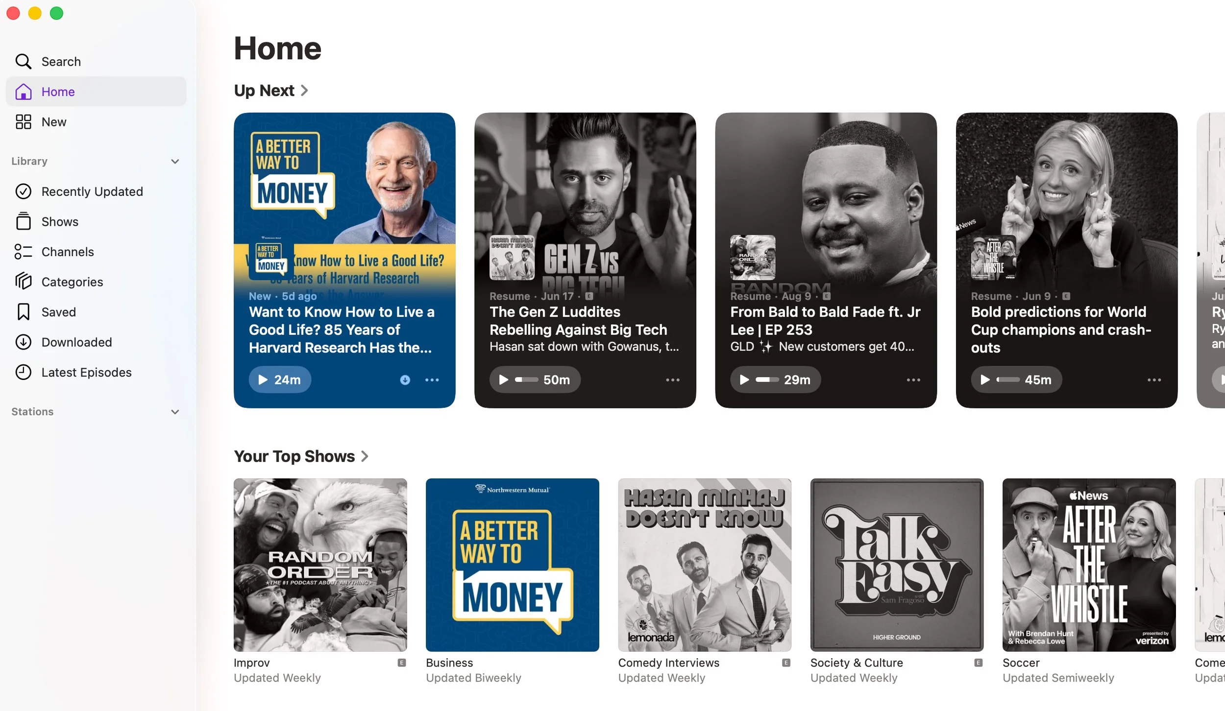
The show needed to feel less like a corporate podcast and more like a person. Adding real faces — hosts, guests, real people — gave it a layer of connection a logo alone couldn't.
Episode Card Evolution
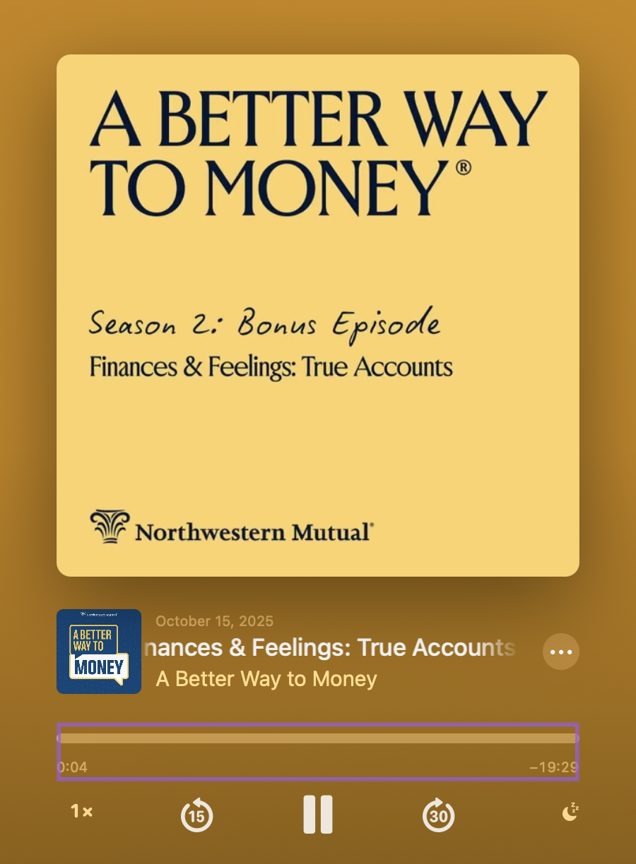
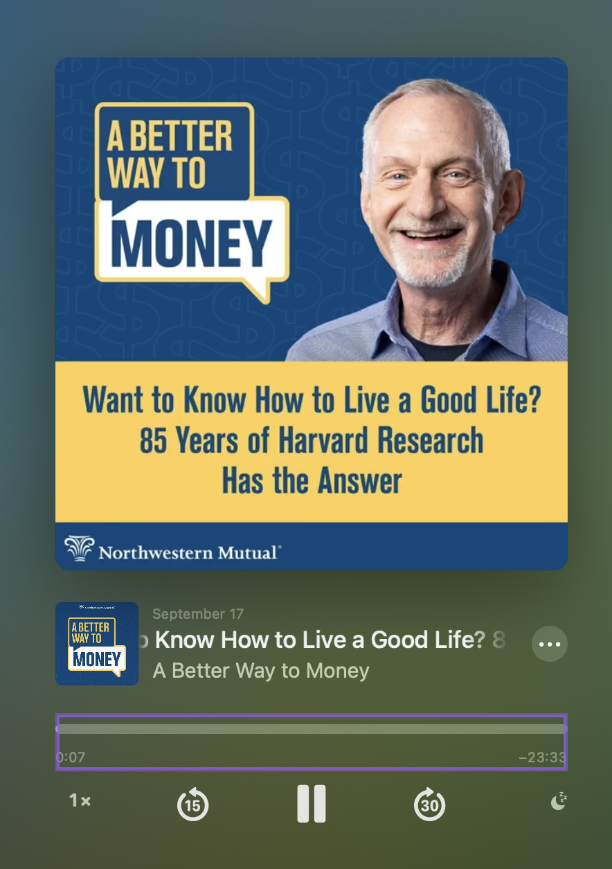
Our Episode cards needed to be thoughtful, engaging and bold to get attention and to connect with our audience and compete for the eyes reoccurring and new listeners.
Cards need to grab attention fast. A real face does that better than plain text.
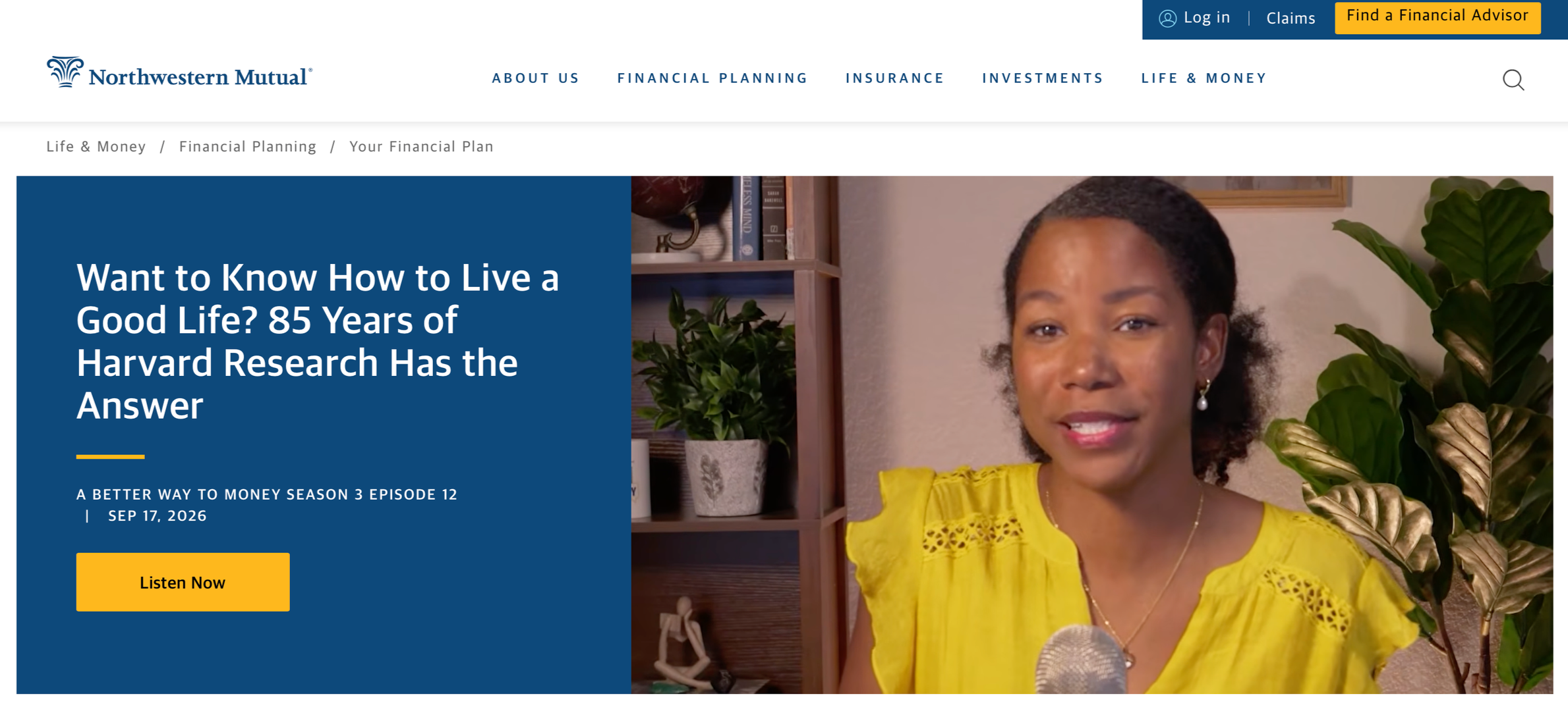
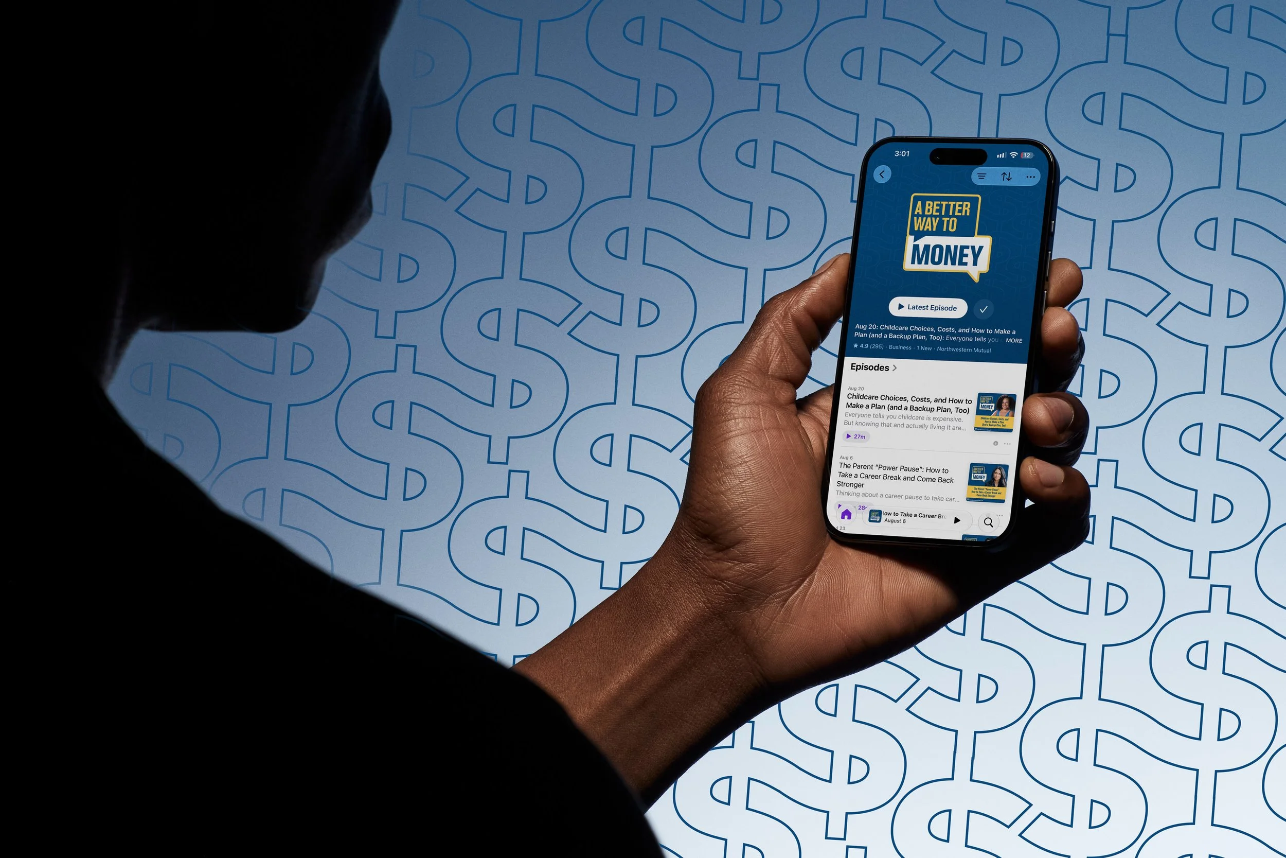
Everywhere it shows up
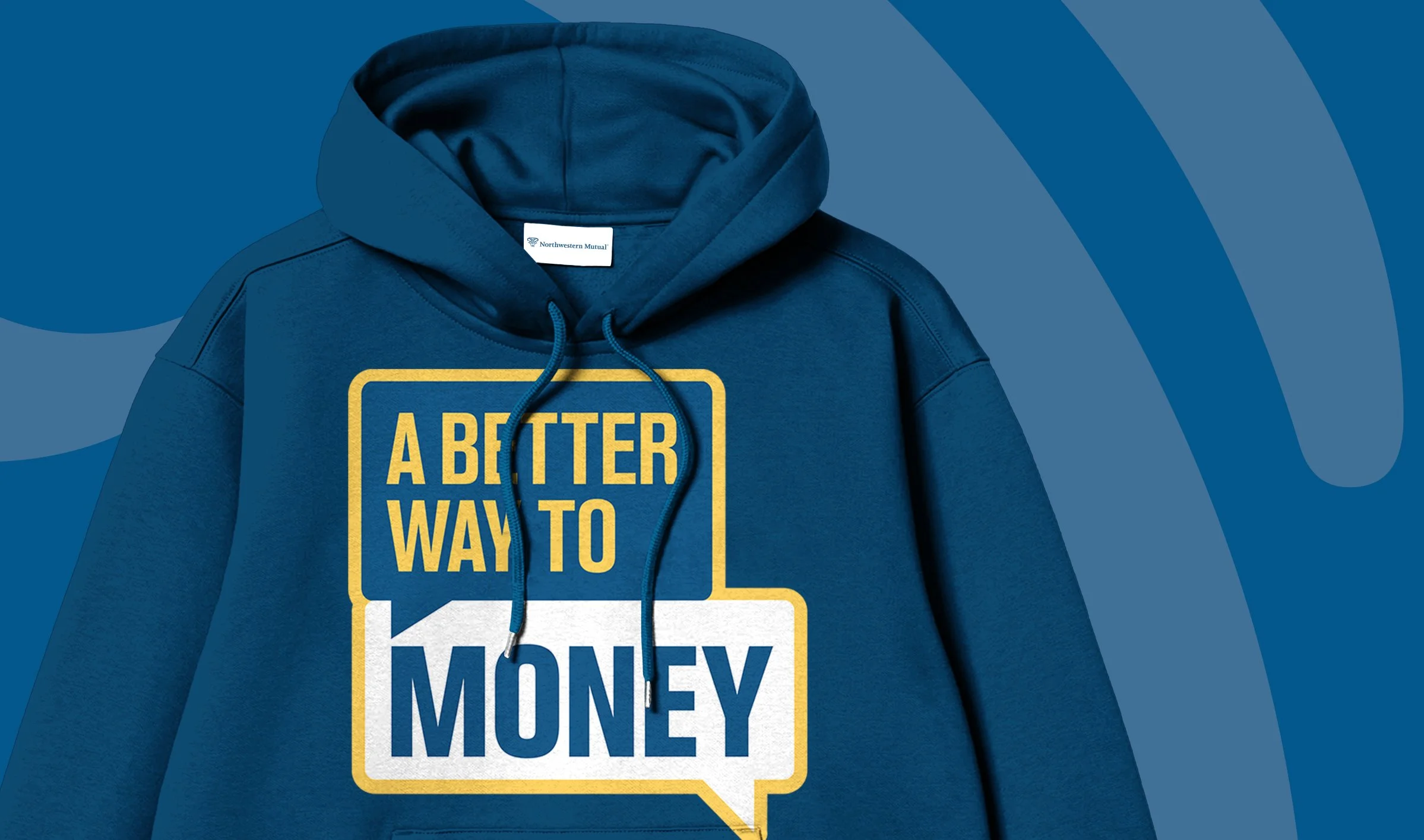
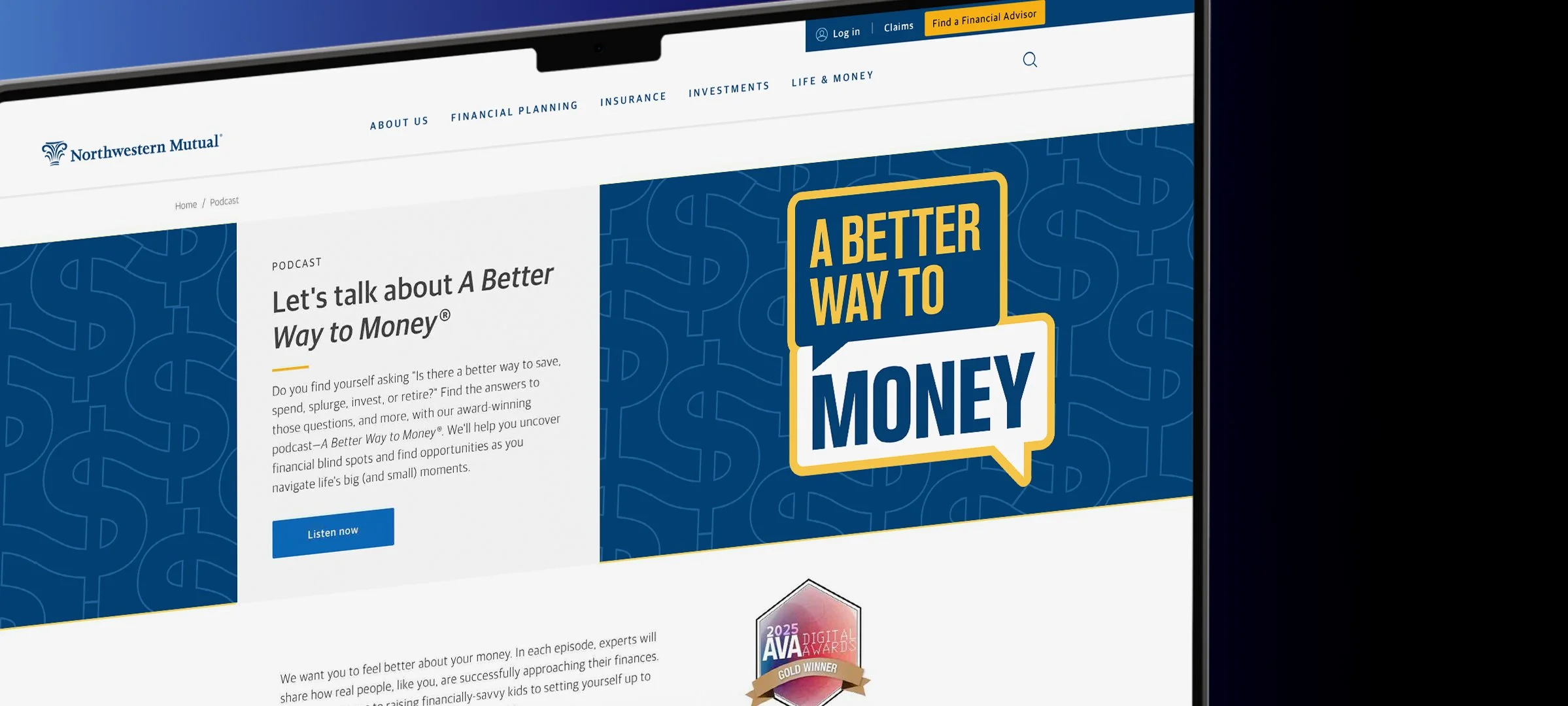
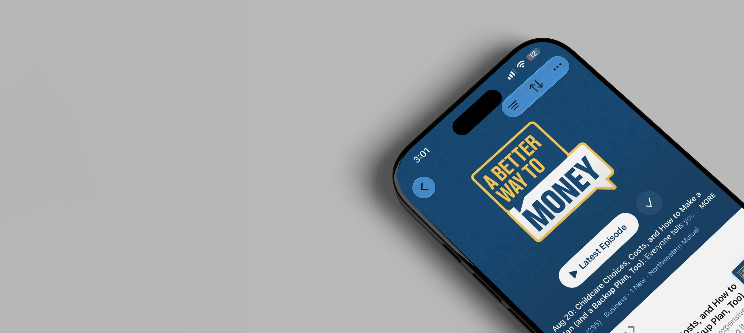
Episode card, website, hoodie — same logo, same colors, everywhere.